flowchart LR
    A[Scatterplot] --> B[Describe the Pattern]
    B --> C[Compute Correlation]
    C --> D[Interpret with Caution]
Part 1: Understanding Relationships — Correlation
ImportantThe goal of this section
Correlation is one of the first tools analysts use to understand whether two variables move together.
It helps answer three basic questions:
- Direction: Do the variables move in the same direction or opposite directions?
- Strength: How tightly do they move together?
- Caution: Could the pattern be misleading?
In business, correlation is often the beginning of analysis, not the end of it.
1.1 Why Correlation Matters
Before building regression models, it helps to understand whether any relationship seems to exist at all.
Correlation is useful because it can help you:
- screen for potentially important relationships,
- identify variables worth modeling later,
- detect variables that may move together,
- begin asking better business questions.
Example business questions
- Do higher advertising levels tend to go with higher sales?
- Do higher prices tend to go with lower demand?
- Do more experienced employees tend to perform better?
- Do stores with higher staffing levels tend to have higher revenue?
These are not yet full decision questions. They are relationship questions. Correlation helps us start there.
1.2 Always Look at the Data First
A correlation coefficient is useful, but a graph often tells the story faster and more accurately.
A good analyst usually follows this order:
- Graph the variables
- Describe the pattern
- Compute the correlation
- Ask whether the result is trustworthy
TipCore habit
Do not interpret a correlation number before looking at the scatterplot.
The same correlation value can come from very different looking datasets.
1.3 Correlation vs. Correlation Coefficient
In everyday conversation, people often use the word correlation loosely. For example, someone might say:
- “There is a strong correlation between price and demand.”
- “These two variables are highly correlated.”
- “The correlation is about 0.6.”
Those statements are common, but it helps to separate two related ideas.
Correlation as a general concept
At a broad level, correlation means a way of describing how two variables move together.
That is a general idea, not just one formula. In statistics, there are several different ways to measure this depending on: - the kind of data, - the shape of the relationship, - and the assumptions we are willing to make.
Correlation coefficient as a specific number
A correlation coefficient is a specific numerical summary of the relationship.
So when someone gives you a number like: - 0.75, - -0.42, - or 0.03,
they are referring to a particular correlation coefficient, not just the general idea of correlation.
1.4 What People Usually Mean by “Correlation”
In most business, analytics, and classroom conversations, when people say correlation, they are usually referring to the Pearson correlation coefficient, even if they never say the word “Pearson.”
That matters because Pearson correlation measures only one specific thing:
the strength and direction of a linear relationship
between two variables.
ImportantKey clarification
In most general conversation, “correlation” usually means:
Pearson correlation
unless someone explicitly tells you otherwise.
This is helpful because it tells you how to interpret what people mean. But it is also dangerous if you forget that Pearson correlation is only about straight-line relationships.
1.5 What Pearson Correlation Measures
The Pearson correlation coefficient, usually written as r, ranges from:
- +1 = perfect positive linear relationship
- 0 = no linear relationship
- -1 = perfect negative linear relationship
Direction
- Positive correlation: as one variable increases, the other tends to increase
- Negative correlation: as one variable increases, the other tends to decrease
Strength
- A stronger correlation means the points tend to fall closer to a straight line
- A weaker correlation means the points are more scattered
Warning
Pearson correlation measures linear association only.
A relationship can be strong, visible, and important, but still have a low Pearson correlation if the pattern is curved rather than straight.
1.6 Other Correlation Measures (Brief Mention Only)
There are other correlation measures besides Pearson’s.
Some are: - rank-based, and - non-parametric
These are often used when: - the data are not well behaved, - the assumptions behind Pearson correlation are less appropriate, - or the analyst wants a measure that is less sensitive to unusual features of the data.
We will not go deeply into those measures in this course.
NoteWhat to remember
For this course, and for most general business discussions, when someone says “correlation,” you should assume they mean Pearson correlation unless they specify another measure.
1.7 Simulated Scatterplots: How to Read Correlation
The examples below are simulated so that you can clearly see how different relationships look.
Example A: Strong positive relationship
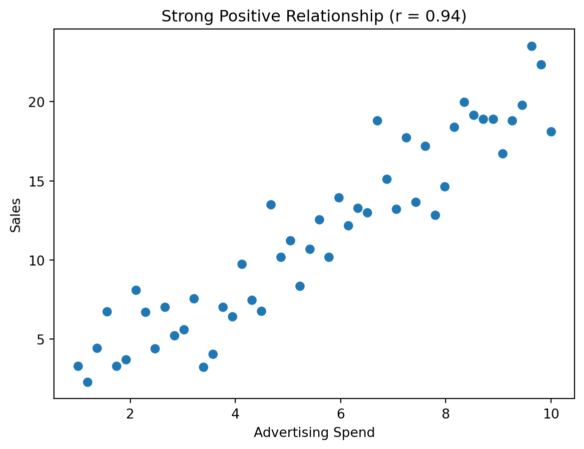
In this graph, the points move upward from left to right. The points are not perfectly on a line, but they are fairly close. That is what a strong positive correlation looks like.
A business interpretation might be:
Stores or months with higher advertising tend to have higher sales.
That does not yet prove advertising caused higher sales, but it does suggest a meaningful relationship worth studying further.
Example B: Weak positive relationship
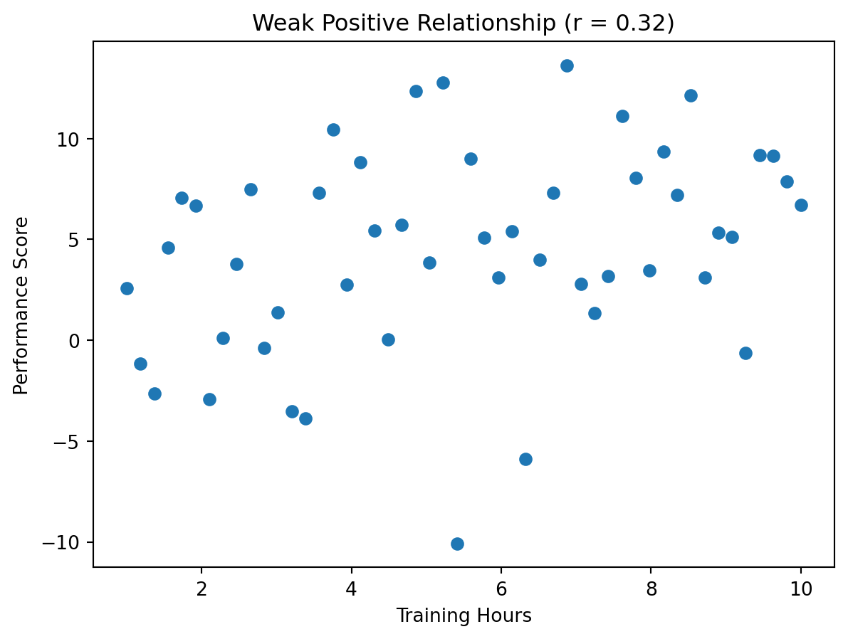
This plot still trends upward, but the pattern is much looser. That means the relationship is weaker and prediction would be less reliable.
Example C: Strong negative relationship
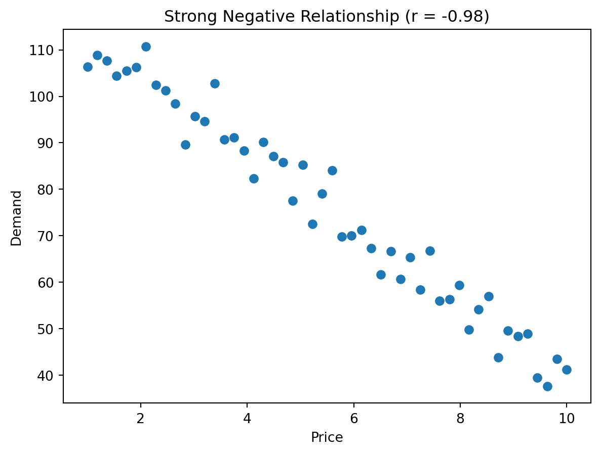
This is the pattern you might expect when price and demand are negatively related. As price rises, demand tends to fall.
Example D: Near-zero correlation
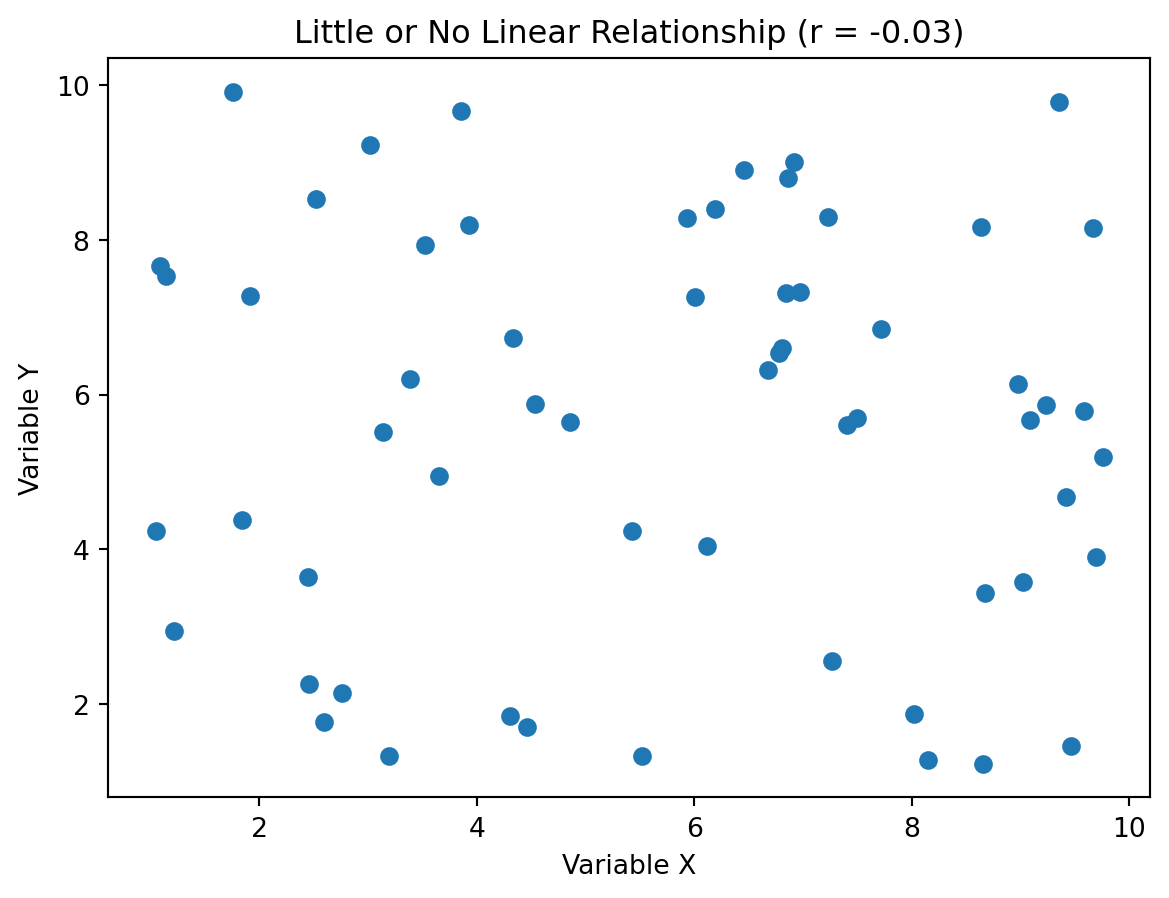
When there is no clear upward or downward pattern, the correlation tends to be close to zero.
1.8 Rough Guidelines for Interpreting Magnitude
Correlation values should be interpreted with context, but the table below is a useful starting point.
| Correlation (r) | Rough interpretation |
|---|---|
| +0.70 to +1.00 | Strong positive relationship |
| +0.30 to +0.69 | Moderate positive relationship |
| +0.01 to +0.29 | Weak positive relationship |
| 0.00 | No linear relationship |
| -0.01 to -0.29 | Weak negative relationship |
| -0.30 to -0.69 | Moderate negative relationship |
| -0.70 to -1.00 | Strong negative relationship |
Note
These are guidelines, not laws. In some business settings, a correlation of 0.20 may still matter. In others, even 0.50 may not be enough to drive a decision.
1.9 Correlation Does Not Tell the Whole Story
A correlation number is a summary. Summaries are useful, but they can hide important details.
Two datasets can have: - similar correlation values, - but very different visual patterns, - and therefore different business interpretations.
That is why graphs are so important.
1.10 How Outliers Can Change Correlation
One of the most important warnings about correlation is that an unusual observation can strongly affect the result.
Below is a simulated example.
Step 1: Correlation without an outlier
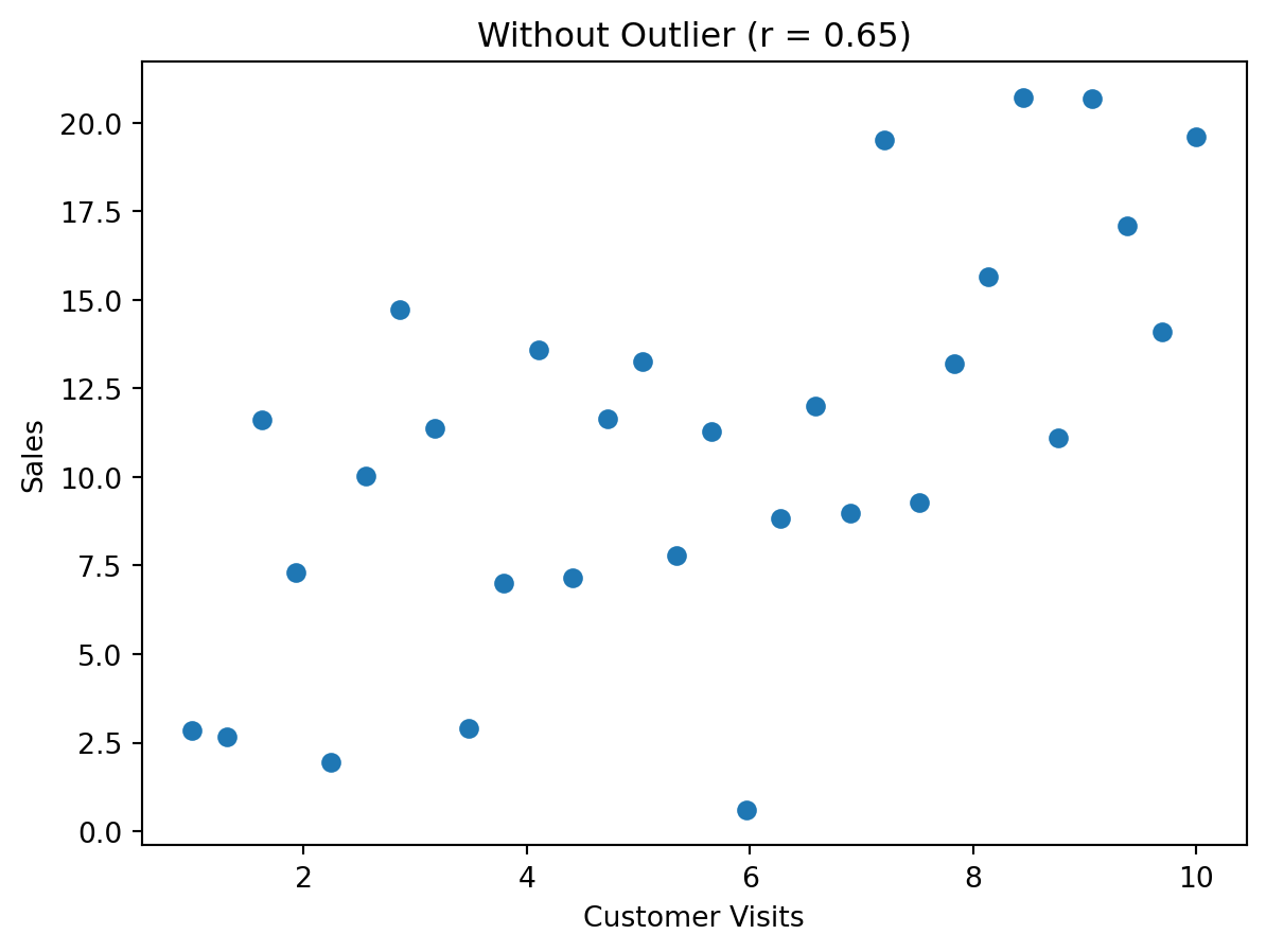
This plot shows a moderate positive relationship. Now watch what happens when we add one unusual point.
Step 2: Add one outlier
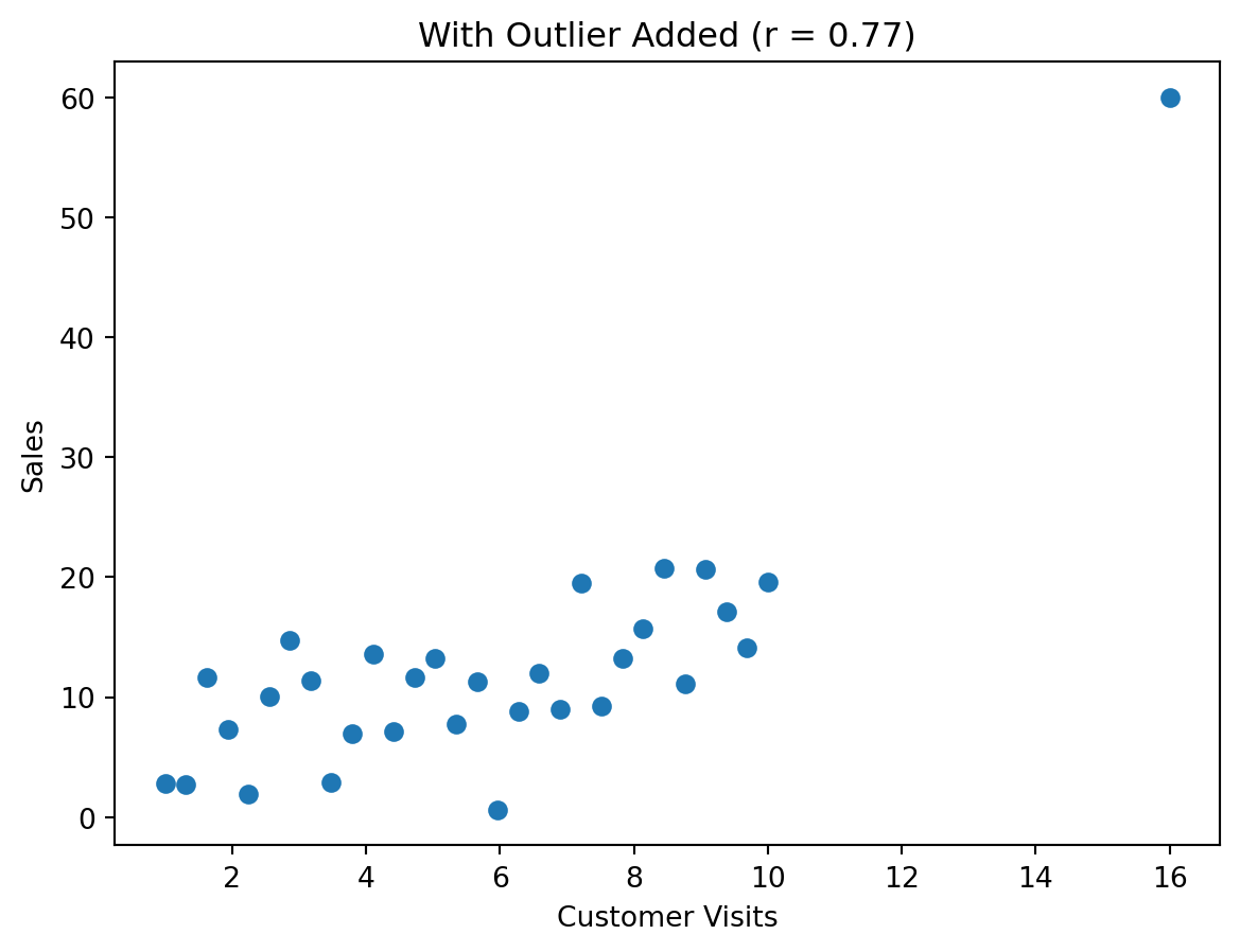
What changed?
The single added point pulls the relationship upward and can make the overall pattern look stronger than it really is.
That means: - a few unusual points can distort your interpretation, - correlation should never be treated as automatic truth, - and you should always scan for unusual observations.
ImportantPractical lesson
If the correlation changes a lot because of one or two points, your conclusion may not be very stable.
1.11 A Different Outlier Pattern: Weakening Correlation
Outliers do not always strengthen correlation. They can also weaken it.
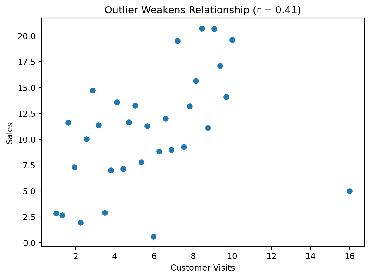
Now the unusual point pulls in the opposite direction and weakens the measured correlation.
This is why an analyst should never say:
“The correlation is X, so the relationship is definitely Y.”
Instead, a better statement is:
“The data show a relationship of approximately X, but I should inspect the graph to see whether outliers or unusual structure are influencing that result.”
1.12 Nonlinear Relationships: Strong Pattern, Low Correlation
A very common misunderstanding is to think that a low correlation always means there is no relationship.
That is false.
Below is an example where the relationship is strong, but curved rather than linear.
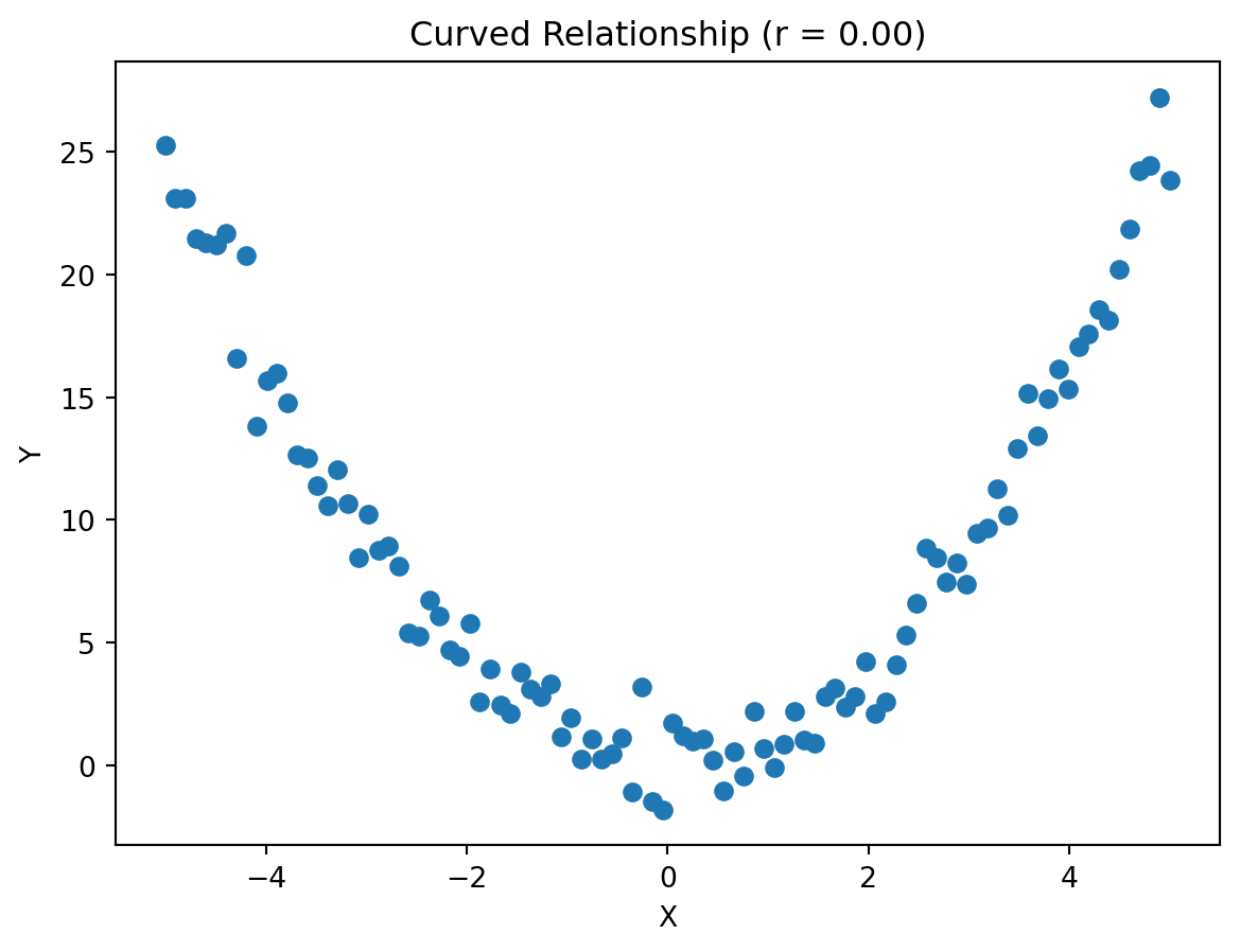
This graph clearly shows structure. The points are not random. But because the pattern is curved, the linear correlation may be close to zero.
Warning
A correlation near zero does not necessarily mean “no relationship.” It may simply mean “no straight-line relationship.”
1.14 Step-by-Step in JMP: Creating a Correlation and Scatterplot
Below is a practical walkthrough for how students might do this in JMP. There is more than one way to study correlation visually, and students should be comfortable with the two most common approaches in this course.
Option 1: Use Graph Builder for a quick scatterplot
- Open your dataset in JMP.
- Go to Graph.
- Choose Graph Builder.
- Drag one variable to the X axis.
- Drag the other variable to the Y axis.
- Make sure the points element is turned on.
- Look at the shape of the pattern:
- upward,
- downward,
- scattered,
- curved,
- or influenced by unusual points.
This is often the fastest way to visually inspect the relationship.
Option 2: Use Analyze > Fit Y by X
This path is especially useful because it combines a visual display with formal output.
- Open your dataset in JMP.
- Go to Analyze.
- Choose Fit Y by X.
- Put the outcome or response variable in the Y, Response box.
- Put the explanatory variable in the X, Factor box.
- Click OK.
If both variables are continuous, JMP will produce a bivariate scatterplot.
From that output, students can:
- visually inspect whether the relationship looks positive, negative, weak, strong, or curved,
- look for unusual points or potential outliers,
- and use the red triangle menu for additional options.
How to get the correlation from Fit Y by X
After running Fit Y by X with two continuous variables:
- Click the red triangle next to the Bivariate heading.
- Look for options related to the fit and summaries for the relationship.
- Use the output to inspect the strength and direction of the linear association.
Even when using Fit Y by X, students should still focus first on the scatterplot itself before relying on the numeric summary.
To create a correlation matrix in JMP
When you want correlations for several variables at once:
- Open your dataset.
- Go to Analyze.
- Choose Multivariate Methods.
- Select Multivariate.
- Move the variables of interest into the Y, Columns box.
- Click OK.
- Look for the correlation matrix in the output.
- Identify:
- positive vs negative signs,
- stronger vs weaker magnitudes,
- and whether any relationships deserve a closer visual review.
What students should focus on in JMP
Do not stop at the number. Ask:
- Does the graph match the correlation?
- Are there outliers?
- Does the relationship look linear?
- Does Fit Y by X tell the same story as the scatterplot?
- Would segmenting the data change the story?
1.15 Mini Case: Price and Demand
NoteScenario
A retailer studies historical data and finds that the correlation between price and units sold is -0.65.
At first glance, this suggests that higher prices are associated with lower demand.
That sounds reasonable. But before recommending a pricing change, a good analyst should still ask:
- Were promotions occurring at the same time?
- Are luxury and budget products mixed together?
- Did competitor actions affect both price and demand?
- Were seasonal effects present?
A disciplined interpretation
A careful analyst might say:
“There is a moderately strong negative association between price and demand in the historical data. This is consistent with the idea that higher prices may reduce demand, but additional analysis is needed before treating the relationship as causal.”
That kind of wording is strong, useful, and appropriately cautious.
1.16 Check Your Understanding
Questions
What is the difference between correlation as a general concept and a correlation coefficient?
When people say “correlation” in most business settings, what are they usually referring to?
What does a correlation of +0.80 mean in plain language?
Why should you look at a scatterplot before interpreting a correlation coefficient?
Can a correlation near zero still occur when there is a real relationship between two variables?
How can a single outlier change a correlation?
Why does a strong correlation not automatically justify a business decision?
In the price and demand case, name two reasons the observed correlation might not represent a true causal effect of price.
Suggested answers
TipReveal suggested answers
1. What is the difference between correlation as a general concept and a correlation coefficient?
Correlation is the broad idea of measuring how two variables move together. A correlation coefficient is a specific numerical measure of that relationship.
2. When people say “correlation” in most business settings, what are they usually referring to?
They are usually referring to the Pearson correlation coefficient, even if they do not explicitly say “Pearson.”
3. What does a correlation of +0.80 mean in plain language?
It means there is a strong positive linear relationship: as one variable increases, the other tends to increase as well.
4. Why should you look at a scatterplot before interpreting a correlation coefficient?
Because the graph may reveal outliers, curvature, clustering, or other structure that the correlation number alone hides.
5. Can a correlation near zero still occur when there is a real relationship between two variables?
Yes. A nonlinear relationship may be strong visually but still have a low linear correlation.
6. How can a single outlier change a correlation?
An outlier can either increase or decrease the correlation substantially by pulling the overall pattern in one direction.
7. Why does a strong correlation not automatically justify a business decision?
Because the relationship may not be causal, may be affected by omitted variables, or may not hold in a different setting.
8. In the price and demand case, name two reasons the observed correlation might not represent a true causal effect of price.
Possible answers include promotions, product mix, seasonality, competitor actions, or segmentation differences.
1.17 Key Takeaways
ImportantWhat to remember from Part 1
- Correlation is the broad idea of how variables move together; a correlation coefficient is a specific numeric measure
- In most general discussion, “correlation” usually means Pearson correlation
- Pearson correlation measures the direction and strength of a linear relationship
- A scatterplot should usually come before interpreting the correlation number
- Outliers can strongly distort correlation
- A low Pearson correlation does not always mean “no relationship”
- Correlation is useful for exploration, but it does not prove causality
1.18 Looking Ahead
In the next section, we move from correlation to simple linear regression.
Correlation tells us whether two variables move together. Regression goes further by helping us describe the relationship with an equation, interpret slopes, and begin quantifying how much one variable changes as another changes.